The influence of anthropogenic global warming is seen in various natural indicators, some of which are listed below. Each will provide links to additional resources or reading on the subject.
Links to more detailed information on these areas and more can be found on the research links page of the site.
Surface Temperatures | Atmospheric CO2 Concentration | Sea Level | Ocean Acidity | Glacial Retreat | Arctic Ice Melt | Antarctic Ice Melt | Solar Irradiance
Surface Temperature
Surface temperatures from land and ocean based stations and, more recently, weather balloons, satellites, and oceanic buoys have shown a notable rise in global temperatures over the industrial period. Four major repositories for global temperature data are listed below. Surface station data is utilized by NASA’s Goddard Institute for Space Studies (GISS) and the UK’s Hadley Centre to trend global temperatures since the 1880’s. The University of Alabama at Huntsville (UAH) and Remote Sensing Systems (RSS) leverage satellite data to trend global temperatures since the late 1970’s. All four data sets have noted similar increases in global temperatures over their respective time periods of coverage.
Temperature variations during the early half of the 20th century have been largely attributed to natural climate influences. However, these same natural mechanisms cannot account for the increase in temperatures seen in the latter part of the century and the early part of the current century which have been largely attributed to human influences on the global climate.
Most recently, 2010 tied with 2005 as the warmest year on record.
|
“Global average surface temperatures during the last three decades have been progressively warmer than all earlier decades, making 2000-09 (the 2000s) the warmest decade in the instrumental record.”
– NOAA National Climatic Data Center, State of the Climate in 2009
|
|
Additional Resources:
|
As atmospheric temperatures rise, oceanic temperatures rise as well. However, like a pot of water on a stovetop, it takes time for atmospheric temperature rises to be reflected in oceanic temperatures, especially considering the volume of water in the Earth’s oceans. Similar to atmospheric temperatures, oceanic temperatures vary based on location. They are also heavily influenced by global wind and ocean currents.
|
Additional Resources:
|
Global Monthly Mean Surface Air Temperature Change, 1999-Present. Data sources: NASA GISS, UAH, RSS, HadCRUT
CLICK TO ENLARGE
Climatological normals are assessed over periods of at least 30 years. Changes over shorter time periods are generally a result of short-term natural variability, noise beneath which is the longer term climate trend signal. A common misconception is that there has been global cooling since 1998. However, despite this much shorter time period, trends from all four temperature data sources have continued steadily upward since 1998.
|
“Half of the globe has warmed at least one half of one degree Fahrenheit (0.3 C) in the past 30 years, while half of that – a full quarter of the globe – warmed at least one full degree Fahrenheit (0.6 C).”
– Dr. John Christy, University of Alabama at Huntsville, December 2008
|
|
Additional Resources:
|
Atmospheric CO2 Concentration
Decades ago measurements of atmospheric CO2 concentrations began at the Mauna Loa observatory in Hawaii. As CO2 is mixed well throughout the atmosphere, this measurement is representative of global CO2 concentrations.
As of March 2011, the mean atmospheric concentration of CO2 measured at Mauna Loa was 392 parts per million (ppm), a rise of 40% since the pre-industrial period and, based on ice core records, the highest level in at least 800,000 years and likely the last several million years.
|
“Since 1751 approximately 329 billion tons of carbon have been released to the atmosphere from the consumption of fossil fuels and cement production. Half of these emissions have occurred since the mid 1970s.”
– U.S. Department of Energy, 2006
|
|
Additional Resources:
|
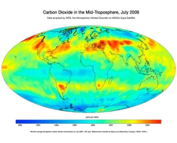
Once emitted, CO2 can remain in the atmosphere for over 100 years. This long atmospheric lifetime enables CO2 to permeate and accumulate in the atmosphere. NASA’s Atmospheric Infrared Sounder (AIRS) instrument, aboard its Aqua satellite, has enabled global atmospheric measurements of CO2 and other gases since its launch in May 2002. Data from AIRS confirms that rises in CO2 are reflected globally, with atmospheric concentrations of CO2 varying by as little as 7 parts per million (ppm) around the world.
So, the effects of rising CO2 levels are felt everywhere and will be felt for a very long period of time.
|
“Generally accepted modern understanding of the global carbon cycle indicates that climate effects of CO2 releases to the atmosphere will persist for tens, if not hundreds, of thousands of years into the future.”
– “Atmospheric Lifetime of Fossil Fuel Carbon Dioxide”, Archer et al, Jan 2009
|
|
Additional Resources:
|
Ice cores drilled in Antarctica and Greenland reveal that the current atmospheric concentration of CO2 is higher than it’s been at any time in the last 800,000 years and likely the last several million years.
|
Additional Resources:
|
Sea Level
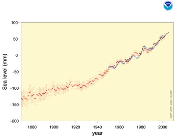
With rising atmospheric and oceanic temperatures, sea levels rise as well due to both thermal expansion and the addition of meltwater from glaciers. This is a graph of sea level change from 1870 to the present from the National Oceanic and Atmospheric Administration (NOAA).
Depicted are annual averages of the global mean sea level based on reconstructed sea level fields since 1870 (red), tide gauge measurements since 1950 (blue), and satellite altimetry since 1992 (black). Units are in mm relative to the average for 1961 to 1990. Error bars are 90% confidence intervals.
|
“The global average sea level rose by just under .07 inches per year during the 20th century, but that number has risen to .12 inches per year since the early 1990s.”
– National Academies of Science, 2009
|
|
Additional Resources:
|
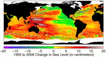
Depicted is a more detailed look at sea level rise from 1993 to the present from CSIRO based on satellite measurements.
|
Additional Resources:
|
Satellite measurements of global sea-level change.
|
Additional Resources:
|
Ocean Acidity

Change in sea surface pH from the pre-industrial period (1700s) to the present day (1990s)
CLICK TO ENLARGE
As CO2 is dissolved into the world’s oceans, that CO2 causes ocean waters to become more acidic. This change in pH of the world’s oceans can have significant effects on ocean life. The lower the pH, the more acidic the water. Below is a map graph of the change in pH from the 1700’s to the present.
The acidity of global surface waters has increased by 30% in just the last 200 years.
|
“The current rate of change is much more rapid than during any event over the last 65 million years. These changes in ocean chemistry are irreversible for many thousands of years, and the biological consequences could last much longer.”
– The Interacademy Panel, June 1, 2009
|
|
Additional Resources:
|
Glacial Retreat
The World Glacier Monitoring Service (WGMS) tracks the advancement and retreat of 115 glaciers around the world in North America, South America, Europe, Asia, and Antarctica.
The image shows mean cumulative specific mass balance of all reported glaciers (black line) and the reference glaciers (red line).
|
“The new data [for 2009 and 2010] continues the global trend in strong ice loss over the past few decades…”
– World Glacier Monitoring Service
|
|
Additional Resources:
|
Arctic Ice Melt

Northern Hemisphere Sea Ice Anomaly, 1979-Present. Image credit: University of Illinois.
CLICK TO ENLARGE
The Arctic, around the Earth’s northern pole, is largely comprised of sea ice. The extent of this ice over the last 30 years of direct satellite observation has been in steady decline.
|
“Ice extent for September 2010 [the low point for the year] was the third lowest in the satellite record for the month, behind 2007 (lowest) and 2008 (second lowest). The linear rate of decline of September ice extent over the period 1979 to 2010 is now 81,400 square kilometers (31,400 square miles) per year, or 11.5% per decade relative to the 1979 to 2000 average.”
– National Snow and Ice Data Center, October 4, 2010
|
|
Additional Resources:
|

Arctic Sea Ice Volume Anomaly, 1979-Present. Image credit: University of Washington.
CLICK TO ENLARGE
Arctic sea ice extent varies annually with seasonal changes, growing in the Arctic winter, receding in summer, and then repeating. There is ice that remains throughout these yearly changes. This multi-year, or older, ice is generally much thicker than the yearly, or young, ice that grows and melts each winter and summer. As temperatures rise, the amount of this older ice is also in decline, so, when sea ice extent recovers each year, it’s increasingly made up of younger, thinner ice that is much more susceptible to melting. As a result, not only is the Arctic sea ice extent in decline, the overall volume of ice, which takes into account ice thickness, is in decline as well.
|
“Monthly average Arctic Ice Volume for Sept 2010 was 4,000 km3, the lowest over the 1979-2010 period, 78% below the 1979 maximum and 9,400 km3 or 70% below its mean for the 1979-2009 period.”
– Polar Science Center
|
|
Additional Resources:
|
Antarctic Ice Melt
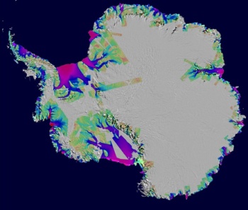
The ice shelves surrounding the Antarctic continent are losing ice rapidly. And while this ice loss may or may not be offset by gained ice in the interior of the continent, the region is changing.
The image depicts Antarctic ice loss between 1996 and 2006, overlaid on a Moderate Resolution Imaging Spectroradiometer (MODIS) mosaic image of Antarctica. The colors indicate the speed of the ice loss. Purple/red is fast. Green is slow.
|
Additional Resources:
|
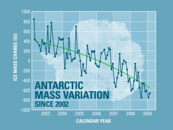
Based on mass balance measurements from NASA satellites, Antarctica is losing mass overall.
|
“Antarctica has been losing more than a hundred cubic kilometers (24 cubic miles) of ice each year since 2002. The latest data reveal that Antarctica is losing ice at an accelerating rate.”
– Erik Conway, NASA JPL, January 2010
|
|
Additional Resources:
|
Solar Irradiance
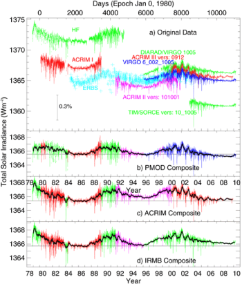
Fluctuations in solar output can affect global climate in short term time frames. Below is a graph of various satellite measurements of solar output from 1978, when these measures were first measured directly from space, to 2010.
|
“Although the changes in [solar brightness and Earth’s temperature] tend to follow each other for roughly the first 120 years [of the last 150], the Earth’s temperature has risen dramatically in the last 30 years while the solar brightness has not appreciably increased in this time.”
– Prof. Sami K. Solanki, Max-Plank Society, August 2004
|
|
Additional Resources:
|





Comments are closed.